Gallery Walls Above Furniture
How to hang a gallery wall above a sofa, bed, or console table with better gap sizing, width proportions, visual weight, and Wall Objects for a real-to-scale furniture anchor.
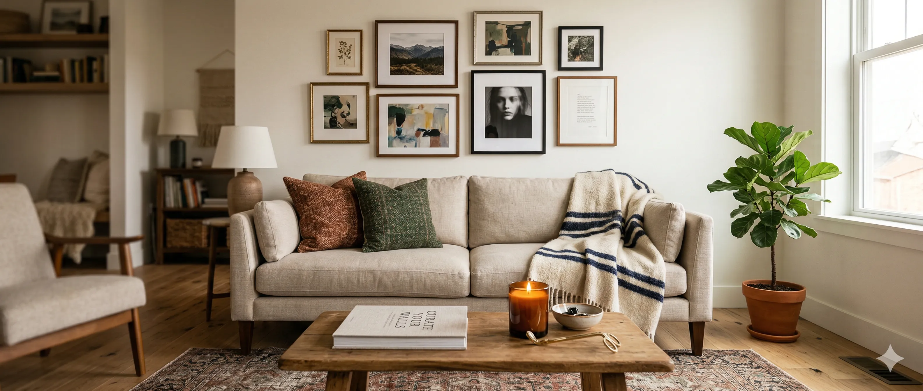
A gallery wall above a sofa, console table, or bed should feel like it belongs there — like the furniture and the frames are part of the same arrangement. When it works, the combination anchors the room. When it doesn't, the frames look like they're floating on the wall with no connection to anything below.
The difference comes down to three things: gap size, width proportion, and visual weight distribution.
The Anchor Principle
Art above furniture must feel connected to that furniture. This isn't about matching styles (you can hang modern art above a vintage sofa). It's about spatial relationship: the gap between the top of the furniture and the bottom of the lowest frame.
Too much gap and the art floats. Too little and it feels cramped.
| Gap | Effect |
|---|---|
| Under 4 inches | Frames feel stacked on the furniture — claustrophobic |
| 6–10 inches | Sweet spot — art and furniture read as one unit |
| 12–18 inches | Starting to disconnect — might still work with large art |
| Over 18 inches | Art is floating — no visual anchor to the furniture below |
The 6–10 inch range is your target. This works for sofas, console tables, beds, and most other horizontal furniture pieces.
Width Proportions
The width of your gallery grouping relative to the furniture below is the single biggest factor in whether the arrangement looks intentional or accidental.
| Proportion | Look | When to Use |
|---|---|---|
| 50–60% of furniture width | Modest, safe, conservative | Formal rooms, symmetrical arrangements |
| 60–75% of furniture width | Balanced, confident — the most common recommendation | Most living rooms, bedrooms, dining rooms |
| 75–90% of furniture width | Bold, statement-making, fills the space | Large walls, casual rooms, salon-style walls |
| Over 100% of furniture width | Art extends beyond the furniture edges — intentional only | Full salon walls that use furniture as a starting point, not a constraint |
When in doubt, aim for 2/3. A gallery that spans roughly two-thirds the width of the sofa or headboard below it almost always looks right.
Sofa Gallery Walls
The "gallery wall above the sofa" is the most common gallery wall in homes. It's also where most proportion mistakes happen.
Standard Sofa Sizing
| Sofa Width | Gallery Width (2/3) | Recommended Frames |
|---|---|---|
| 72" (6 ft) | ~48" | 5–7 frames in a salon arrangement, or one 30x40 centerpiece with flanking pieces |
| 84" (7 ft) | ~56" | 7–9 frames, or a pair of large pieces with smaller satellites |
| 96" (8 ft) | ~64" | 9–12 frames across a wider arrangement |
Sofa-Specific Tips
- Don't go too high. The center of your gallery should be at roughly 57–60 inches from the floor — standard eye level when standing. This often means the bottom frame is only 6–8 inches above the sofa back.
- Account for cushion height. People sitting on the sofa shouldn't be able to bump the lowest frame with their head when they lean back. If your sofa has high cushions, increase the gap to 10–12 inches.
- Symmetry or asymmetry — pick one. A symmetrical arrangement over a symmetrical sofa (matching side tables, centered on the wall) looks clean and traditional. Asymmetry works when the room layout is already informal.
Bed and Headboard Gallery Walls
Art above the bed is viewed from two angles: lying in bed (looking up) and from the bedroom doorway. Both matter.
Headboard Sizing
| Headboard Type | Gallery Placement |
|---|---|
| Tall upholstered headboard (48"+) | Only 4–6 inches of gap. The headboard acts as a visual base — don't fight it with too much space. |
| Low or no headboard | 8–10 inches above the top of the pillows (or where the headboard would be). |
| Bed frame only | Center the gallery on the wall at 57–60 inches, using the bed width as your proportion guide. |
Safety Note
Frames directly above a bed should be secured more carefully than elsewhere. Use D-ring hardware (not wire), check hooks annually, and avoid heavy glass frames over the pillow zone. Acrylic glazing is lighter and safer.
Console Table and Entryway Gallery Walls
Console tables are narrower than sofas, which changes the proportion math.
| Console Width | Gallery Width | Note |
|---|---|---|
| 36" | 24–27" | Small grouping — 3 frames or one mid-sized piece |
| 48" | 32–36" | Medium grouping — 3–5 frames |
| 60" | 40–45" | Larger grouping — 5–7 frames |
Console-Specific Tips
- Console tables are tall. Most are 30–34 inches high. Combined with 6–10 inches of gap, your bottom frame starts at 36–44 inches. Make sure the top of your arrangement doesn't end up awkwardly close to the ceiling.
- Account for objects on the console. Lamps, vases, and other items add visual height. If you have a 24-inch tall lamp on the console, the "gap" effectively starts from the top of the lamp, not the table surface.
- Lean + hang combos work well. Lean a large frame or mirror on the console and hang smaller frames above and around it. This creates depth and connects the table surface to the wall.
Visual Weight and Balance
A gallery wall above furniture should feel balanced — not perfectly symmetrical (unless that's your style), but visually weighted so it doesn't feel like it's about to tip over.
Weight Distribution Rules
| Principle | Application |
|---|---|
| Heavier at center | Place your largest or darkest frame near the center of the grouping. It anchors the arrangement. |
| Lighter at edges | Smaller frames and lighter content at the outer edges keep things from feeling top-heavy. |
| Balance dark and light | If you have one very dark frame, balance it with a similarly weighted piece on the other side. |
| Gallery center = furniture center | The visual center of your gallery should align with the visual center of the furniture below. Not necessarily the wall center. |
Off-center furniture? If your sofa is positioned off-center on the wall (common in open floor plans), center the gallery above the sofa, not the wall. The anchor relationship matters more than wall symmetry.
The Wall Object Technique in GalleryPlanner
GalleryPlanner now has Wall Objects, so you can model the thing that is actually below the art instead of faking it with a frame:
- Add the right Wall Object. Choose Sofa, Headboard, or Custom. For a 72" wide, 34" tall sofa, use the Sofa preset or size a Custom object to match the furniture footprint.
- Position it against the bottom of the wall where the furniture sits.
- Leave it unlocked while you fine-tune the placement, then lock it only if you want to keep it from shifting.
- Design your gallery around the object, maintaining 6–10 inches of gap above it and keeping within the 2/3 width guideline.
- Leave it in the export. The hanging guide uses the object as a reference, but excludes it from the measurement table.
This gives you an accurate, to-scale representation of how your gallery relates to the furniture below it, without relying on the old labeled-frame workaround.
Common Mistakes
| Mistake | Why It Fails | Fix |
|---|---|---|
| Art wider than the furniture | Looks top-heavy, unmoored, like the wall is falling forward | Stay within 75% of furniture width (90% max for bold salon walls) |
| Too much gap | Art disconnected from furniture; two separate elements on the wall | Close the gap to 6–10 inches |
| All frames at the same height | Rigid, predictable, wastes vertical space | Stagger heights within the grouping |
| Ignoring lamp and object height | Frames overlap visually with items on the furniture surface | Account for the tallest object on the furniture as your baseline |
Plan Your Layout
Getting the furniture-to-art relationship right is easier when you can see the real proportions before putting holes in the wall. Use GalleryPlanner to set your wall dimensions, add your planned frame sizes, and use the Wall Object technique to simulate the furniture below the gallery.
Start planning your gallery wall →
Ready to Generate a Layout?
Open GalleryPlanner with Auto-Layout ready and turn these ideas into a wall plan with real dimensions.
Launch GalleryPlanner