Gallery Wall Styles and Layout Ideas
Compare grid, salon, symmetrical, asymmetrical, and themed gallery wall styles so you can choose a layout that fits your room, frames, and decorating style.
The best gallery wall style is the one that matches your room, your frame collection, and how structured you want the wall to feel. This guide breaks down the main options so you can choose grid, salon, symmetrical, or asymmetrical with less guesswork.
Why Gallery Wall Style Matters
Your gallery wall style should complement:
- Your interior design aesthetic (modern, traditional, eclectic, minimalist)
- The room's function (formal dining room vs. casual family room)
- Your frame collection (uniform vs. mixed sizes and styles)
- Your personality (structured and organized vs. creative and free-flowing)
Choosing the right style ensures your gallery wall feels intentional rather than random.
The 5 Core Gallery Wall Styles
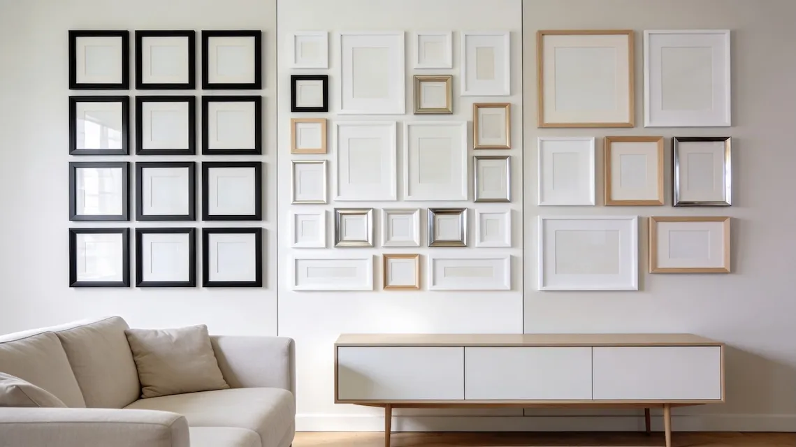
1. Grid Layout
Visual: Clean rows and columns with perfect alignment and uniform spacing.
Aesthetic: Modern, minimalist, organized, calm.
Best for:
- Contemporary or Scandinavian interiors
- Displaying a photo series (family portraits, travel collection, etc.)
- Creating visual rhythm in long hallways
- People who love symmetry and order
Frame requirements:
- Identical or very similar frame sizes work best
- Matching frame colors (all black, all white, all natural wood)
- Consistent orientation (all landscape or all portrait—or a deliberate mix)
Spacing guidelines:
- 2-3 inches between frames, uniformly
- Equal margins from wall edges
- Perfect horizontal and vertical alignment
Common configurations:
- 2×2 (4 frames in a square)
- 3×3 (9 frames)
- 2×4 or 3×4 (rectangular grid)
- Single row (3-5 frames horizontally)
Pro tip: Use GalleryPlanner's Grid algorithm to auto-generate perfect grid layouts. It calculates spacing and centering automatically.
Mistakes to avoid:
- Mixing too many frame sizes—stick to 1-2 max
- Uneven spacing (use a ruler or GalleryPlanner's precision tools)
- Hanging the grid too high—center should be at eye level (57-60" from floor)
2. Salon-Style Wall
Visual: Dense, floor-to-ceiling arrangement of frames in various sizes, covering most of the wall.
Aesthetic: Eclectic, curated, maximalist, gallery-inspired (think: museum or Parisian apartment).
Best for:
- Traditional, bohemian, or eclectic interiors
- Showcasing diverse art collections (vintage prints, photography, paintings)
- Creating a dramatic statement wall
- People who love visual richness and storytelling
Frame requirements:
- Mix of sizes, shapes, and orientations
- Varied frame styles (gold, wood, black, ornate, simple)
- Diverse content (art, photos, mirrors, even 3D objects)
Spacing guidelines:
- Consistent spacing (still 2-3 inches) despite the chaos
- Frames should feel close together but never touching
- Fill most of the wall—aim for 70-80% coverage
How to execute:
- Start with the largest or most important piece (your anchor)
- Build outward from the anchor, adding progressively smaller frames
- Step back frequently to check balance
- Fill gaps with smaller frames
Pro tip: Salon walls look chaotic but require meticulous planning. Use GalleryPlanner's Monte Carlo algorithm to generate organic, salon-style layouts that maintain visual balance.
Mistakes to avoid:
- Leaving inconsistent gaps (some 1 inch, some 6 inches)
- Failing to establish a focal point
- Mixing too many frame styles (keep it to 3-4 max)
3. Symmetrical Layout
Visual: A balanced arrangement where the left and right sides mirror each other around a central axis.
Aesthetic: Formal, traditional, harmonious, balanced.
Best for:
- Formal dining rooms, entryways, or living rooms
- Above fireplaces or console tables
- Creating a sense of calm and order
- People who appreciate classical design principles
Frame requirements:
- Pairs of matching frames (two 8×10, two 11×14, etc.)
- Central anchor piece (often the largest frame or a mirror)
- Consistent frame styles across the composition
Spacing guidelines:
- Equal spacing on both sides of the centerline
- Maintain consistent gaps between all frames
- Align frames horizontally at top, bottom, or centerline
Common configurations:
- Single large frame in center, smaller frames flanking on both sides
- Pyramid shape (largest at bottom center, smaller frames stepping up)
- Mirrored L-shapes or stair-step patterns
Pro tip: Find your centerline first (mark it lightly with a pencil), then build out symmetrically from that line.
Mistakes to avoid:
- Imperfect symmetry (measure carefully!)
- Forgetting to center the entire arrangement on the wall
- Using frames that are almost matching but slightly different (e.g., one 11×14 and one 12×16)
4. Asymmetrical Layout
Visual: An organic, balanced arrangement without mirror symmetry.
Aesthetic: Contemporary, dynamic, creative, approachable.
Best for:
- Modern or transitional interiors
- Creating visual interest without formality
- Mixing frame sizes and orientations freely
- People who want flexibility and creativity
Frame requirements:
- Mix of sizes, but usually within a cohesive range
- Can mix orientations (landscape + portrait)
- Frame styles should still be somewhat consistent (e.g., all black frames, or black + wood)
Spacing guidelines:
- Maintain consistent spacing (still 2-3 inches)
- Achieve visual balance rather than perfect symmetry
- Distribute visual weight evenly (large dark frame on left = several small light frames on right)
How to execute:
- Establish an invisible geometric shape (triangle, circle, rectangle)
- Arrange frames to loosely fill that shape
- Balance heavy elements (large, dark, busy frames) with light elements (small, light, simple frames)
- Allow for intentional negative space
Pro tip: Asymmetrical layouts are the hardest to get right because there's no formula. Use GalleryPlanner's Masonry or Skyline algorithms as a starting point, then adjust manually.
Mistakes to avoid:
- Creating accidental symmetry (if you want asymmetry, commit to it!)
- Unbalanced visual weight (all large frames on one side)
- Too much randomness—asymmetrical ≠ chaotic
5. Themed Gallery Wall
Visual: Frames unified by a common theme rather than a specific arrangement style.
Aesthetic: Curated, storytelling, personal, cohesive.
Examples:
- Travel wall: Photos from a specific trip or world travels
- Family timeline: Photos arranged chronologically
- Color-themed: All black-and-white photos, or all frames in one color palette
- Subject-themed: All botanical prints, all vintage maps, all dog photos
Best for:
- Personal spaces (bedrooms, home offices, nurseries)
- Telling a visual story
- Creating emotional connection
- People who value meaning over aesthetics
Frame requirements:
- Content is king—frames and sizes are secondary
- Often uses consistent framing to unify diverse content
Spacing guidelines:
- Can follow any of the above styles (grid, salon, symmetrical, asymmetrical)
- Theme dictates content; style dictates arrangement
Pro tip: Start by gathering all your themed content first, then decide on the arrangement style based on how many pieces you have and their sizes.
How to Choose Your Gallery Wall Style
Use these quick reference tables to find your best match:
By Interior Design Style
| Your Home Style | Recommended Gallery Styles |
|---|---|
| Modern/Minimalist | Grid or Asymmetrical |
| Traditional/Classic | Symmetrical or Salon |
| Eclectic/Bohemian | Salon or Asymmetrical |
| Scandinavian/Farmhouse | Grid or Symmetrical |
| Contemporary | Asymmetrical or Grid |
By Frame Collection
| Your Frame Situation | Best Style |
|---|---|
| All the same size | Grid (perfect fit!) |
| Mix of 2-3 sizes | Symmetrical or Asymmetrical |
| Many different sizes | Salon or Asymmetrical |
| Unique/unusual frames | Salon or Themed |
By Personality
| Your Vibe | Best Styles |
|---|---|
| Organized, structured, calm | Grid or Symmetrical |
| Creative, dynamic, lively | Asymmetrical or Salon |
| Storytelling, personal | Themed (any arrangement) |
| Dramatic, statement-making | Salon |
Mixing Styles: Advanced Techniques
Once you master the basics, you can combine styles for unique results:
Grid + Salon Hybrid
Create a loose grid structure, but vary frame sizes within each "cell" for a more organic feel.
Example: A 3×3 grid where each cell contains 1-3 frames of varying sizes, all aligned within their grid section.
Symmetrical + Asymmetrical Hybrid
Use symmetry for the overall shape, but vary frames within each side (so it's mirrored in shape but not identical).
Example: Both sides have three frames in a diagonal arrangement, but the frames themselves are different sizes on each side.
Themed + Grid
Combine thematic content with grid precision.
Example: A 4×4 grid of 16 square frames, each containing a photo from a different country you've visited.
Room-Specific Style Recommendations
| Room | Best Styles | Notes |
|---|---|---|
| Living Room | Salon, Asymmetrical, Symmetrical | Salon for drama; Symmetrical above fireplace |
| Hallway | Grid, Linear Asymmetrical | Single row or column works best |
| Bedroom | Symmetrical, Themed, Grid | Symmetrical above bed; Themed for personal photos |
| Dining Room | Symmetrical, Salon | Symmetrical for formal; Salon for conversational |
| Home Office | Grid, Themed | Grid for professional look; Themed for vision boards |
| Staircase | Asymmetrical, Salon | Follow the stair angle with asymmetrical arrangements |
Visualizing Your Chosen Style with GalleryPlanner
Not sure which style will work for your space? Try them all using GalleryPlanner:
- Open GalleryPlanner and input your wall dimensions
- Add your frame inventory
- Use Auto-Layout to generate examples of each style:
- Grid → Use Grid algorithm
- Salon → Use Monte Carlo algorithm
- Asymmetrical → Use Masonry or Skyline algorithm
- Symmetrical → Design manually (or use Grid as a starting point)
- Compare results and pick your favorite
Final Thoughts: There's No Wrong Choice
The beauty of gallery walls is their versatility. Your chosen style should:
- Feel right for your space and personality
- Work with your existing decor
- Showcase your content beautifully
Don't get paralyzed by perfection—even "imperfect" gallery walls can be stunning if they're intentional and well-executed.
Ready to Generate a Layout?
Open GalleryPlanner with Auto-Layout ready and turn these ideas into a wall plan with real dimensions.
Launch GalleryPlanner