Gallery Wall Spacing and Alignment Tips
Use professional spacing, alignment, and edge-matching techniques to make your gallery wall feel cleaner, calmer, and easier to hang accurately on the first try — plus how to drive the in-app Align and Distribute tools.
Perfect spacing and alignment separate amateur gallery walls from professional installations. This guide reveals the industry-standard techniques that interior designers use to create crisp, balanced layouts—and how to apply them to your own projects.
Why Spacing and Alignment Matter
Even the most beautiful frames can look sloppy if spacing is inconsistent or alignment is off. Proper spacing and alignment:
- Create visual rhythm that guides the eye smoothly across your wall
- Signal intentionality (proving this isn't just "random frames thrown up")
- Enhance cohesion in eclectic layouts
- Prevent a cluttered appearance even with many frames
Bottom line: Spacing and alignment are the invisible glue that hold your gallery wall together.
The Golden Spacing Rules
Here's a quick reference before diving into the details:
| Rule | Measurement | Notes |
|---|---|---|
| Frame-to-frame spacing | 2-3 inches | Consistent throughout the layout |
| Above furniture | 6-10 inches | From furniture top to frame bottom |
| Eye-level center | 57-60 inches | Center of entire layout from floor |
| Wall coverage | 50-70% | Leave breathing room |
Rule 1: The 2-3 Inch Standard
The rule: Maintain 2-3 inches between all frames, consistently.
| Spacing | Best For | Feel |
|---|---|---|
| 2 inches | Grid layouts, uniform frames | Tight, modern, cohesive |
| 3 inches | Mixed sizes, salon walls | Balanced, breathable |
| < 2 inches | — | Too cramped |
| > 4 inches | — | Feels disconnected |
Why these numbers?
- 2 inches: Tight, modern, cohesive—best for uniform frames (e.g., grid layouts)
- 3 inches: Slightly more breathing room—best for mixed sizes and salon walls
- Anything less than 2": Frames feel cramped and crowded
- Anything more than 4": The layout starts to feel disconnected
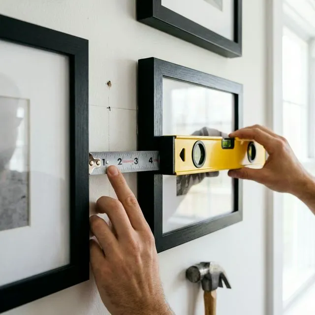
How to measure: Measure from frame edge to frame edge, not mat to mat or photo to photo. The outer frame is what matters.
Consistency is key: Pick 2" OR 3" and stick to it everywhere. Don't use 2" in some spots and 4" in others (unless you're doing an advanced asymmetrical layout).
Rule 2: Equal Edge Margins
The rule: Leave equal space from the edges of your layout to the wall boundaries.
Why it works: Centering your layout creates balance and prevents the "floating frames randomly on a wall" look.
How to calculate:
- Measure your wall width (e.g., 96 inches)
- Measure your total layout width (e.g., 70 inches)
- Subtract: 96 - 70 = 26 inches remaining
- Divide by 2: 26 ÷ 2 = 13 inches margin on each side
Same applies vertically for top and bottom margins.
Pro tip: Use GalleryPlanner to auto-calculate perfect margins. It centers your layout automatically.
Rule 3: Negative Space is Your Friend
The rule: Don't fill more than 60-70% of your wall with frames.
Why it works: Negative space (empty wall) gives your eye a place to rest and prevents visual overwhelm.
How to check:
- Estimate your wall area (width × height)
- Estimate your total frame area (sum of all frame areas)
- If frames cover more than 70%, remove a few or increase wall size
Example:
- Wall: 96" × 72" = 6,912 sq in
- Frames: 10 frames averaging 100 sq in each = 1,000 sq in
- Coverage: 1,000 ÷ 6,912 = ~14% (too sparse!)
- Action: Add more frames OR reduce wall area
Sweet spot: 50-70% coverage depending on style (grids tend toward 50%, salon walls toward 70%).
Pro Shortcut: Center at Eye Level
GalleryPlanner Pro includes a one-click Center at Eye Level action for the selected layout.
- Centers the composition around 60 inches from the floor by default
- Adjustable in Settings if your preferred Eye Level target is different
- Works well when you want a repeatable starting point for a new wall or a variation of an existing one
Turn on the Eye Level guide in the canvas when you want a visible baseline, then adjust the edges afterward.
Alignment Techniques: Creating Visual Order
Alignment is what makes asymmetrical or eclectic layouts feel cohesive instead of chaotic.
Technique 1: Horizontal Alignment
What it is: Aligning frames along a horizontal line (top edge, bottom edge, or centerline).
When to use:
- Linear layouts (single row of frames)
- Skyline-style walls
- Above furniture (sofa, console table, bed)
How to execute:
- Decide on your alignment line (e.g., "top edges at 60 inches from floor")
- Mark a light pencil line on your wall
- Hang all frames so their top edges align to this line
Variations:
- Top-align: All frames have the same top edge (creates a clean horizontal line)
- Bottom-align: All frames have the same bottom edge (common above furniture)
- Center-align: All frames centered on the same horizontal line (works with varying heights)
Pro tip: Use a laser level or painter's tape to mark your alignment line before hanging.
Technique 2: Vertical Alignment
What it is: Aligning frames along a vertical line (left edge, right edge, or centerline).
When to use:
- Column layouts (stacked frames)
- Asymmetrical layouts that need structure
- Staircase walls
How to execute:
- Establish a vertical centerline or edge line
- Align frames so their edges or centers match this line
Example: A vertical column of 3 frames, all centered on the same vertical line, with 3 inches between each frame.
Technique 3: Grid Alignment
What it is: Frames aligned both horizontally AND vertically in a perfect grid.
When to use:
- Uniform frame sizes
- Modern, minimalist aesthetics
- Photo series or collections
How to execute:
- Use GalleryPlanner's Grid algorithm to calculate exact positions
- Mark all positions on your wall with a pencil
- Hang frames according to marks
Key measurements:
- Consistent horizontal spacing (e.g., 2" between all frames left-to-right)
- Consistent vertical spacing (e.g., 2" between all frames top-to-bottom)
- Entire grid centered on the wall
Pro tip: Grid alignment is the easiest to get right because it's formulaic. It's also the least forgiving—even a 1/4" error is noticeable.
Technique 4: Invisible Shapes (Advanced)
What it is: Arranging frames to loosely fill an invisible geometric shape (circle, triangle, rectangle, diamond).
When to use:
- Asymmetrical layouts
- Salon walls
- Creative, artistic compositions
How to execute:
- Imagine (or lightly sketch) a shape on your wall (e.g., a large circle)
- Arrange frames to loosely stay within that shape's boundaries
- Allow some frames to break the boundary slightly for organic feel
Common shapes:
- Circle: Frames radiate outward from a central point, staying within a circular boundary
- Triangle: Pyramid shape with largest frame at bottom center
- Rectangle: Frames fill a rectangular area without perfectly aligning
Pro tip: This technique creates cohesion in otherwise chaotic layouts. The eye sees the overall shape even if individual frames vary wildly.
The Eye-Level Rule
The rule: The center of your gallery wall should be at 57-60 inches from the floor.
Why this height?
- 57-60" is average eye level for most adults
- Museums and galleries use this standard
- It feels natural and accessible
How to calculate the center:
- Measure the total height of your layout (e.g., 48 inches tall)
- Divide by 2 to find the midpoint (48 ÷ 2 = 24 inches)
- Add 57 inches (or your preferred eye level): 57 + 24 = 81 inches from floor to top of layout
- Mark this point on your wall, then measure down 24 inches to find your center mark
Exceptions:
- Staircase walls: Eye level changes as you climb—use a sliding scale
- Above furniture: Bottom of frames should be 6-10 inches above furniture top (this may adjust overall eye-level positioning)
- Children's spaces: Lower the center to child eye level (around 48")
Spacing Scenarios: Solving Common Challenges
Scenario 1: One Large + Several Small Frames
The challenge: Small frames look lost next to the large focal point.
The solution:
- Group small frames into a cluster (2-3 frames close together)
- Treat the cluster as a single visual unit
- Maintain standard 2-3" spacing between the cluster and the large frame
Example: One 16×20 on the left, a cluster of three 5×7 frames on the right (with only 1" spacing within the cluster, but 3" from the cluster to the 16×20).
Scenario 2: Frames Above Furniture
The challenge: Determining the right spacing between furniture and frames.
The solution:
- Minimum: 6 inches above furniture
- Optimal: 8-10 inches
- Maximum: 12 inches (beyond this, frames feel disconnected from the furniture)
Why: This spacing visually "anchors" the gallery wall to the furniture below, creating a cohesive unit.
Pro tip: For sofas specifically, aim for your gallery wall to be 2/3 to 3/4 the width of the sofa for proportional balance.
Scenario 3: Filling Awkward Gaps
The challenge: You've spaced most frames at 2", but now you have a weird 6" gap that feels too large.
The solution:
- Option A: Add a small frame to fill the gap (5×7 or smaller)
- Option B: Redistribute spacing—slightly increase all gaps to make the 6" gap feel intentional
- Option C: Embrace the negative space as an intentional design element (works in minimalist layouts)
What not to do: Leave the 6" gap while all others are 2"—it will look like a mistake.
Tools for Perfect Spacing and Alignment
Tool 1: GalleryPlanner (Digital)
What it does: Calculates exact spacing and alignment automatically. Exports a PDF with precise measurements (Pro Only).
When to use: Always. Planning digitally prevents costly mistakes.
Doing it in the app: Select two or more frames on the canvas and the floating toolbar appears above them. From there:
- Align — snap selected frames left, center, right, top, middle, or bottom relative to each other (or relative to the wall when a single frame is selected).
- Distribute — select 3 or more frames and tap Distribute Horizontal or Distribute Vertical to equalize the gaps between them in one click. This is the fastest way to fix uneven 2", 2.5", 2.25" gap drift across a row.
- Snap-to-grid — toggle with
Son desktop, or from the Glass HUD on canvas. Frames also snap to alignment guides from other frames as you drag. - Center at Eye Level (Pro) — drops your selection onto the 60" / 150 cm eye-level baseline so your wall's vertical anchor is consistent.
Tool 2: Paper Templates
What it does: Full-size paper cutouts of your frames that you tape to the wall to preview placement.
How to use:
- Cut paper (newspaper, craft paper, or packing paper) to match frame sizes
- Tape paper templates to the wall in your desired arrangement
- Adjust until spacing looks perfect
- Mark nail positions through the paper
- Remove paper and hang real frames
When to use: When you want to see the layout in situ before making holes.
Tool 3: Laser Level
What it does: Projects a perfectly straight horizontal or vertical line on your wall.
When to use: Grid layouts, linear arrangements, any time you need precise alignment.
Cost: $20-50 for a basic model. Worth the investment if you're doing multiple gallery walls.
Tool 4: Painter's Tape
What it does: Marks alignment lines that are easy to remove.
How to use:
- Use a level to place tape in a perfectly horizontal line at your desired height
- Align frame tops or bottoms to the tape
- Remove tape when done
When to use: Horizontal alignment, edge boundaries.
Advanced Spacing Tricks
Trick 1: Variable Spacing (Intentional)
The concept: Not all gaps are 2-3"—some are larger on purpose.
When it works:
- Separating distinct "zones" in a large salon wall
- Creating visual breathing room around the focal point
- Emphasizing negative space in minimalist layouts
How to execute:
- Most gaps: 2"
- Strategic gaps: 5-6" (used sparingly to create separation)
- Key: The large gaps must feel intentional and symmetrical
Example: Three clusters of frames, each cluster has 2" internal spacing, but 6" between clusters.
Trick 2: Breaking the Rules (Carefully)
When it's okay to deviate:
- Architectural constraints (windows, outlets, switches) force adjustments
- Artistic vision requires asymmetry or unexpected gaps
- You're experienced enough to know when breaking rules enhances the design
Golden rule of breaking rules: If you're going to deviate from standard spacing, commit to it. A half-broken rule looks like a mistake; a fully broken rule looks intentional.
Common Spacing and Alignment Mistakes
❌ Mistake 1: Eyeballing It
The problem: "Looks about right" leads to uneven spacing and crooked frames.
The fix: Measure everything. Use a tape measure, level, and ruler. Trust the numbers, not your eye.
❌ Mistake 2: Hanging Too High
The problem: Treating each frame like a standalone piece and hanging at '57" center' individually results in the overall gallery wall being too high.
The fix: The center of the entire layout should be at 57", not each individual frame.
❌ Mistake 3: Inconsistent Spacing
The problem: Some frames are 2" apart, some are 5" apart, with no clear pattern.
The fix: Pick one spacing measurement and stick to it (with rare, intentional exceptions).
❌ Mistake 4: Ignoring Furniture Proximity
The problem: Frames floating too far above furniture or crammed too close.
The fix: 8-10 inches between furniture top and frame bottoms.
Step-by-Step: Measuring and Marking for Perfect Installation
Ready to hang your gallery wall with professional precision? Follow these steps:
Step 1: Plan in GalleryPlanner
- Create your layout digitally
- Export the PDF hanging guide (Pro Only)
- Print it for reference
Step 2: Find Your Center Point
- Measure your wall width and height
- Mark the wall's center point lightly with a pencil
- Use the measurements from your PDF to mark where your layout's center should be
Step 3: Mark Frame Positions
Using your PDF as a guide:
- Mark the top-left corner of your first frame
- Measure and mark the spacing to the next frame (2-3")
- Continue marking all frame positions
- Double-check alignment with a level
Step 4: Mark Nail Positions
For each frame:
- Measure from the top of the frame to the hanging hardware (this varies per frame)
- Subtract this measurement from your frame-top mark to find the nail position
- Mark the nail spot with a small "X"
Step 5: Hang and Adjust
- Hammer nails at marked positions
- Hang frames
- Use a level to ensure they're straight
- Make minor adjustments as needed
Pro tip: Start with the largest/central frame first, then build outward. This lets you make small adjustments to surrounding frames without redoing everything.
Conclusion: Precision Pays Off
Perfect spacing and alignment transform a collection of frames into a cohesive work of art. While it takes extra time to measure and plan, the result is a gallery wall that looks professionally installed.
Key takeaways:
- 2-3 inches between all frames
- 57-60 inches for center of layout
- Use alignment techniques (horizontal, vertical, grid, invisible shapes)
- Plan first using GalleryPlanner to avoid mistakes
Ready to Generate a Layout?
Open GalleryPlanner with Auto-Layout ready and turn these ideas into a wall plan with real dimensions.
Launch GalleryPlanner