Gallery Walls for Small Spaces
Gallery wall ideas for narrow hallways, small bathrooms, above-desk nooks, and tight walls with vertical layouts, low-profile frames, and mirror tricks that keep the room feeling open.
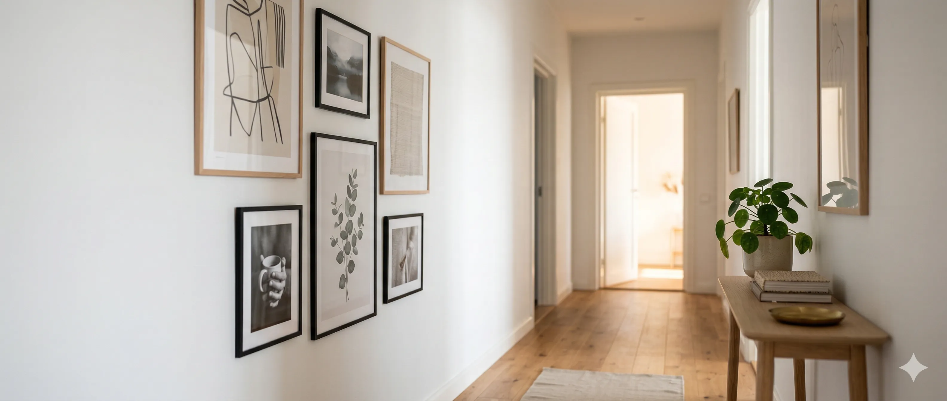
You don't need a 12-foot living room wall to build a gallery worth looking at. Some of the most striking gallery walls live in narrow hallways, above tiny desks, and in powder rooms barely big enough to turn around in.
Small spaces actually have an advantage: constraints force focus. When you only have 36 inches of wall to work with, every frame choice matters — and that intentionality reads as sophistication, not limitation.
Thinking Vertically
The most common mistake in small spaces is spreading frames across the limited horizontal width. This makes a narrow wall feel wider, but also flatter and more cluttered.
Instead, go vertical. A tall, narrow arrangement draws the eye upward, creates a sense of height, and works with the proportions of a small space rather than fighting them.
Vertical Layout Principles
| Guideline | Why It Works |
|---|---|
| Stack frames in a single column | Creates a clean visual line that elongates the wall |
| Vary frame sizes within the column | Prevents the "elevator buttons" look of identical stacked frames |
| Align on center, not edges | Centered alignment is more forgiving of size differences and looks intentional |
| Use odd numbers (3 or 5) | Odd groupings feel more dynamic than even ones |
Ideal Vertical Arrangements
| Wall Width | Frames | Suggested Sizes |
|---|---|---|
| 18–24" | 3 | One 8x10 flanked by two 5x7s (stacked vertically) |
| 24–36" | 3–5 | Mix of 8x10, 5x7, and 4x6 in a centered column |
| 36–48" | 5–7 | Two-column stagger or one bold column with a mix of sizes |
Narrow Hallways
Hallways are gallery wall territory — people naturally slow down in them, and there's nothing else competing for attention. But narrow hallways introduce two practical problems: depth and durability.
Depth Matters
In a hallway under 36 inches wide, bulky frames become obstacles. A 3-inch deep shadow box frame might look great in a living room, but in a narrow hallway, people will brush against it, knock it crooked, and eventually stop noticing it entirely because they've learned to avoid it.
| Hallway Width | Maximum Frame Depth | Frame Style |
|---|---|---|
| Under 30" | 0.5–0.75" | Thin metal or minimal wood profiles |
| 30–36" | 1–1.5" | Standard wood frames, no shadow boxes |
| Over 36" | Any | Full range of options |
Hallway Layout Tips
- Run frames at eye level along the length. A horizontal line of frames at 57–60 inches creates a visual "gallery corridor" effect.
- Keep spacing consistent. In a hallway, uneven spacing feels chaotic rather than artsy. Aim for 2–3 inches between frames.
- Light the hallway, not just the frames. Narrow hallways tend to be dim. Shallow sconces, a few warm LED puck lights, or a picture light on the most prominent piece makes the difference.
- Avoid glass in the busiest hallways. Acrylic is lighter, shatter-resistant, and less reflective. Or go frameless with mounted prints.
Above-Desk and Nook Galleries
The 2–3 feet of wall above a desk, console, or nightstand is premium gallery space — you're eye level with it when seated, which means you'll actually see it daily.
Desk/Workspace Galleries
| Rule | Guideline |
|---|---|
| Width | Keep the arrangement within the width of the desk. Art wider than the furniture looks disconnected. |
| Height | Start 6–8 inches above the top of the desk or shelf and don't go higher than 18–20 inches above it. |
| Content | This is a personal space — photos, postcards, small prints that make you smile during a long afternoon. |
| Scale | Small frames work here. 4x6 and 5x7 are your primary sizes. One 8x10 maximum as a focal point. |
Shelf Ledge Displays
If you don't want to commit to nails, a narrow picture ledge (or even a basic floating shelf) turns a nook into an instant gallery. Stack frames in front of each other, overlap slightly, and lean them against the wall.
Advantages:
- Zero holes in the wall.
- Rearrange instantly by sliding frames.
- Mix in small objects — plants, candles, postcards — for dimension.
Limitations:
- Only works where you have a flat surface.
- Frames can get bumped or knocked over in high-traffic areas.
- Limited to frames that can stand on their own (not too tall and narrow).
Powder Rooms and Bathrooms
Small bathrooms are underrated gallery spaces. People are in there with nothing to look at — a small gallery wall gives them something to appreciate.
Bathroom-Specific Considerations
| Concern | Solution |
|---|---|
| Humidity | Use metal frames or sealed/painted wood. Avoid raw wood, fabric mats, and paper-backed frames. |
| Glass fogging | Acrylic doesn't fog as badly as glass. Or use non-reflective glass. |
| Limited wall space | Above the toilet is the classic spot — roughly 24–30 inches wide, 18–24 inches tall. |
| Content | Bold graphic prints, small photographs, or vintage botanical illustrations work well. Avoid anything irreplaceable in a humid environment. |
The Above-Toilet Gallery
This is probably the most common small-space gallery in the world. The format is simple:
- Two frames side by side (matching, 8x10 or 5x7) for a symmetrical, clean look.
- Three frames in a horizontal row (matching or graduated sizes) for a wider toilet/wall.
- One bold statement piece (11x14 or larger) centered above the tank.
Mirrors as Gallery Members
In small spaces, mirrors do double duty: they're a design element and a space expander. Mixing one or two mirrors into your frame arrangement makes the wall feel larger and adds visual variety.
How to Mix Mirrors
- Match the frame style. The mirror frame should look like it belongs with the other frames, not like it wandered in from the bathroom.
- Use mirrors as accent pieces, not the majority. One or two mirrors in a group of 5–7 frames is the sweet spot.
- Position mirrors to reflect light, not clutter. Angle them to catch a window, lamp, or the opposite wall — not a pile of shoes by the door.
- Round or oval mirrors break up a rectangular grid beautifully and draw the eye.
Common Small-Space Mistakes
| Mistake | Why It Fails | Fix |
|---|---|---|
| Frames too large for the wall | Looks like the frame is wearing the wall instead of decorating it | Keep the gallery within 60–75% of the available wall area |
| Too many small frames | Creates visual noise; feels like a bulletin board | Limit to 5–7 frames in most small spaces |
| Ignoring the furniture below | Frames floating unanchored above nothing | See our Gallery Walls Above Furniture guide |
| All the same size | Reads as a grid, which emphasizes the smallness of each piece | Mix at least two different sizes |
Plan Your Small Space Layout
Small walls have less room for error — one frame in the wrong spot throws off the whole arrangement. Use GalleryPlanner to set your exact wall dimensions and try layouts before committing to nail holes. The Auto-Layout engine handles tight dimensions and will find balanced arrangements that fit your specific space.
Start planning your small-space gallery →
Ready to Generate a Layout?
Open GalleryPlanner with Auto-Layout ready and turn these ideas into a wall plan with real dimensions.
Launch GalleryPlanner