Should You Go Black & White? How to Test a Monochrome Gallery Wall Before You Reprint
Preview black-and-white gallery walls non-destructively with GalleryPlanner before committing to expensive reprints, with tests, evaluation tips, and a cost-saving workflow.
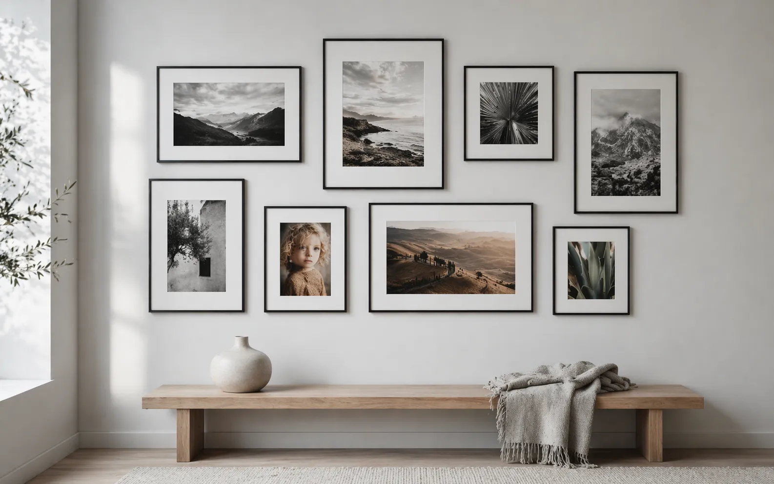
Reprinting framed photographs because "it didn't feel right in B&W" is one of the most expensive mistakes in gallery wall planning. A full wall of 8 photos can easily run $200+ in reprint costs plus another two weeks of waiting, framing, and reinstalling.
GalleryPlanner's B&W Photo Conversion (Pro) is built specifically for avoiding that outcome. It's a non-destructive per-photo toggle that renders any photo — or your whole wall — in black and white on the canvas, so you can see the actual composition before you commit to a single reprint. This guide covers how to use it and, just as important, what it won't tell you.
For the design theory on why B&W works and which subjects shine in monochrome, start with The Monochrome Masterclass. This article is specifically about testing the decision once you've started planning.
The Reprinting Cost Problem
If you've already printed and framed a wall, testing B&W "for real" usually means:
- Reorder every photo as B&W prints (typically $10–$40 per print for gallery-quality)
- Wait 3–7 days for reprints to arrive
- Reframe every piece — sometimes damaging the frames or mats in the process
- Install, then discover you don't like it in three of the five frames
- Reprint those three in color, wait again, reframe, reinstall
The GalleryPlanner B&W toggle replaces that loop with a preview that takes about thirty seconds. You can test all-B&W, all-color, or any specific mix — see which frames read best in each — and order once with the right decision locked in.
How B&W Photo Conversion Works
The toggle is non-destructive and per-photo:
- Your original image file stays untouched. The toggle renders the B&W version on the canvas in real time.
- You can flip any subset of photos — or the whole wall — without losing color originals.
- The B&W state carries through to 4K Snapshots and Print-Ready Photos exports so the file you send to your printer matches exactly what you previewed.
It's also distinct from Smart Fill's "Prefer B&W" Style Toggle. The Smart Fill toggle biases image selection toward photos that are already B&W in your library. The Pro B&W Photo Conversion toggle renders any color photo as monochrome. They can be used together, but they solve different problems.
A Testing Workflow
1. Build the wall in color first
Arrange frames, sizing, and photo choices normally. This is your baseline.
2. Test per-photo, not all at once
Click into each frame and toggle B&W on, one at a time. Ask a narrow question per photo: does this specific image get stronger without color? Keep the answers to that one question — don't second-guess the whole wall yet.
The Monochrome Masterclass has the design principles for which subjects tend to gain or lose from B&W conversion. Apply them photo-by-photo here.
3. Compare the whole wall in both states
Once you've marked up your per-photo choices, do two whole-wall previews:
- Full color (your baseline)
- Full B&W (toggle every photo)
Capture both as 4K Snapshots and open them side-by-side. This is the single most useful comparison — it tells you whether the wall as a composition feels richer or flatter in monochrome, independent of the individual photo verdicts.
4. Consider a mixed-mode wall
You don't have to pick all-or-nothing. Some walls are strongest as a deliberate mix:
- Portraits in B&W, landscapes in color — editorial feel, color on the scenery
- Older/scanned photos in B&W, newer ones in color — hides color-cast variation in old prints
- Anchor piece in color, supporting frames in B&W — creates a clear focal point
The toggle lets you test these combinations in seconds instead of in reprints.
How to Evaluate the Preview
A B&W preview is only as useful as the way you read it. Three checks:
Step back in the canvas. Zoom out to roughly match the real viewing distance — most walls are viewed from 6–8 feet, not from inches away. What reads as "fine" at full zoom often reveals balance problems when the wall is small in frame.
Squint. Reduces detail and forces the eye to read pure tonal distribution — light vs. dark shapes. If one quadrant goes solid black and another solid white, the real wall will feel unbalanced. If the distribution is even, it will hold up.
Pan into individual frames at full size. A photo that reads as gray mush on the canvas will print as gray mush on the wall. Check each frame for genuine tonal depth, not just shape.
What the Toggle Won't Tell You
A preview is a strong signal, not a guarantee. Real-world factors the screen can't simulate:
- Paper finish. Matte softens contrast; gloss sharpens it. Baryta/fiber-base paper renders blacks richer than standard matte.
- Ink set. Some premium printers use a dedicated B&W ink set (multiple shades of gray) for deeper monochrome than a standard "composite black." Consumer and most lab prints don't.
- Framing. A black frame with a white mat reads very differently from a white frame with a black mat — the toggle shows the image, not the frame-plus-mat composition on your actual wall.
- Room lighting. Cool-lit rooms make B&W prints feel clinical; warm-lit rooms make them feel softer. A neutral canvas can't model your lighting.
The B&W toggle gets you ~80% of the decision. The remaining 20% — paper, ink, and framing — is what a single $10–$15 test print resolves before ordering the full wall.
The Pragmatic Workflow
- Design the wall in color in GalleryPlanner.
- Test per-photo and as a whole using Pro B&W Photo Conversion.
- Commit to a final mix — all B&W, all color, or a specific blend.
- Order one test print (no frame) from your intended vendor in your intended paper and ink. Lay it against a sample frame and mat at home.
- If the test print looks right, order the full wall. If not, adjust paper/ink (rarely image choice).
Total incremental cost beyond normal planning: one test print. Total risk avoided: reprinting a wall.
Frequently Asked Questions
Is B&W Photo Conversion free? No — it's a Pro feature. Free users can still use Smart Fill's "Prefer B&W" toggle to bias toward photos that are already B&W in their library. The non-destructive conversion of color photos is part of GalleryPlanner Pro.
Does the toggle affect my original photo file? No. The original file stays intact in your browser's local storage. Toggle off at any time to restore the color preview. Toggle state is saved with the project.
Can I export the B&W preview? Yes. 4K Snapshots and Print-Ready Photos exports honor the current B&W toggle state per photo, so the exported file matches what you previewed on the canvas.
Does the conversion algorithm match what a print lab will do? It approximates a standard luminance-preserving desaturation — close to what most consumer printers and labs produce with a plain "convert to grayscale" choice. If you're ordering from a lab that offers custom B&W processing (e.g., a selenium tone, a split-tone), ask for a proof — the GalleryPlanner preview won't match those specialty looks.
Ready to Keep Planning?
Open GalleryPlanner and jump back into your current wall plan without forcing you into a specific tool first.
Launch GalleryPlanner