The Monochrome Masterclass: Designing a Black & White Gallery Wall
Build a black-and-white gallery wall with stronger tonal contrast, framing choices, and print decisions so monochrome photos still feel layered and warm.
A strong monochrome gallery wall works best when you vary contrast and tonal range instead of making every print look identical. That gives black-and-white images enough separation to feel deliberate instead of flat.
Why Black & White Works So Well on a Group Wall
Color photographs are beautiful individually, but group them together and they compete. Contrasting color temperature (warm orange sunset next to cool blue ocean), competing color palettes, and varying photo editing styles can make a wall feel chaotic.
Black and white is the great equalizer. A photo of your grandmother from 1952, a recent landscape from your phone, and an abstract print from an Etsy shop can all hang side by side without visual conflict—because they speak the same visual language: contrast, tone, and form.
The Foundation: Understanding Tonal Range
Not all black and white photos are created equal. The key variable is tonal range—how much of the spectrum from pure black to pure white a photo uses.
| Tonal Range | Looks Like | Best For |
|---|---|---|
| High contrast | Deep blacks, bright whites, less grey | Drama, architecture, bold faces |
| Low contrast | Soft greys, lots of midtones, minimal blacks | Moodiness, vintage feel, fog/mist |
| Full range | True blacks AND true whites AND rich midtones | Documentary, street, fine art |
The Rule: Mix Contrast Levels
A wall of all high-contrast images feels aggressive. A wall of all low-contrast images feels flat. Aim for 60–70% full-range or medium-contrast images with a handful of high-contrast pieces as "punctuation marks."
Curation: Choosing the Right Images
Subject Matter That Shines in Monochrome
Some subjects benefit especially from the removal of color:
- Portrait photography: Black and white strips away distracting skin tones and draws attention to expression, eyes, and emotion.
- Architecture: Clean lines, geometric shadows, and texture-heavy surfaces become graphic and powerful.
- Street photography: The absence of color gives street shots a timeless, almost documentary quality.
- Landscape/nature: Fog over mountains, bare winter trees, crashing ocean waves—all benefit from the drama of monochrome.
- Abstract/macro: Extreme close-ups of textures (bark, fabric, water) become almost sculptural in B&W.
What to Avoid
- Brightly colored subjects photographed in B&W: A child's birthday party or a colorful market often loses its energy in monochrome—color is the point.
- Underexposed originals converted to B&W: Noisy, dark originals converted to grayscale look muddy and lifeless.
- Inconsistent processing styles: A hand-toned selenium print next to a flat, desaturated phone photo will feel jarring.
A Simple Processing Consistency Rule
If you're converting color photos to black and white, aim for one of three style families and stick to it across your wall:
- Classic/film: Rich contrast, slight grain, no extreme highlights or shadows.
- Soft/vintage: Low contrast, lifted blacks (no true black), matte finish.
- Fine art/dramatic: Maximum contrast, deep blacks, pure whites, graphic.
Frame Selection for Black & White Photos
Because color is absent in the photos, the frames and mat boards become significant design elements.
Frame Color Options
| Frame Color | Aesthetic | Notes |
|---|---|---|
| Matte black | Modern, bold, graphic | Best for high-contrast prints; creates strong definition |
| Natural wood/walnut | Warm, organic | Adds warmth to contrast the coolness of B&W; great in living rooms |
| Gold/antique gold | Luxurious, gallery-like | Makes even simple prints feel like fine art |
| White/off-white | Clean, minimal | Works best with soft/vintage-style processing |
| Mixed metals (silver + black) | Eclectic, collected | Requires careful curation to avoid chaos |
The safest choice: Pick one frame color for 70% of the wall, and introduce a second as an accent.
Mat Boards Matter More in Monochrome
Without color in the photos, the mat becomes part of the visual composition. Consider:
- Bright white mat: Crisp and modern. Best for fine art and graphic photography.
- Warm white/cream mat: Softer, more antique-feeling. Beautiful with portrait photography.
- Black mat: Dramatic and unusual. Makes the print feel like it's floating in space—reserve this for your most striking images.
- No mat (edge-to-edge print): Works well for large, graphic images. Loses its impact on smaller sizes.
Layout Strategies for Monochrome Walls
Play with Print Size Strategically
Black and white photography relies on tonal contrast. Use image size to control visual weight:
- Your most tonally complex or emotionally impactful image gets your biggest frame.
- Small prints (4×6, 5×7) should be your most graphic, highest-contrast images—they can hold their own at a small size.
- Large prints can be softer and more subtle because scale carries the visual weight.
Grid vs. Salon Arrangements
| Layout | Why It Works for B&W | Caution |
|---|---|---|
| Clean grid | The rigidity of the grid becomes part of the design; discipline mirrors the precision of B&W photography | Boring if the prints themselves are similar in composition |
| Salon wall | Allows interesting scale relationships and more editorial feel | Harder to plan; use GalleryPlanner to simulate |
| Linear row | Elegant above a sofa or bed; feels like a curated museum display | Works best with consistent frame sizes |
The "Light Source" Trick
When hanging portrait or landscape photos, try to ensure the light source within each image faces inward toward the center of the arrangement. This subtle technique creates a sense of visual harmony and keeps the eye moving through the composition rather than being pushed off the edges.
Texture & Paper: The Secret Weapon
When you're printing specifically for gallery display, paper choice dramatically affects how a B&W print reads on a wall:
| Paper Type | Finish | Character |
|---|---|---|
| Baryta/fiber base | Slight sheen | Rich blacks, archival, museum-quality; the gold standard |
| Matte fine art paper | Flat | Soft, painterly; excellent for portraits and landscapes |
| Lustre | Between glossy and matte | Versatile; good color depth without glare |
| Glossy | High sheen | Strong contrast but creates glare under direct light |
For a monochrome gallery wall, matte fine art or baryta paper will give you prints that look intentional and premium—not like laser-printed pages.
Using Smart Fill for Monochrome Walls
GalleryPlanner's Smart Fill feature includes a "Prefer B&W" toggle that selects monochromatic images from your library first. Use it in combination with the rest of your curation:
- Upload your full photo library (color and B&W).
- Turn on "Prefer B&W" in Smart Fill settings.
- Run "Fill All Frames" — the AI will preferentially select your grayscale images.
- Manually swap in any specific images you want to feature.
Note: "Prefer B&W" only selects photos that are already B&W in your library. To render color photos as monochrome non-destructively, see the Pro toggle in the next section.
Testing Before You Print (Pro)
Everything above this section is about making a good design decision. This one is about testing that decision before you spend money.
GalleryPlanner Pro includes a B&W Photo Conversion toggle that renders any color photo on your canvas as black and white, non-destructively. It's the cheapest way to preview a mixed or all-B&W wall before committing to reprints.
Use it to:
- Test individual photos — toggle one photo at a time to see which gain from B&W and which lose.
- Preview the whole wall in both states — capture a color 4K Snapshot and a B&W 4K Snapshot, then compare side-by-side.
- Test mixed-mode walls — e.g., portraits in B&W with landscapes in color, without reordering any prints.
- Commit with confidence — the B&W state carries through to Print-Ready Photos exports, so your printer gets exactly what you previewed.
For the full testing workflow, including how to evaluate the preview and what the toggle can't simulate (paper finish, ink set, framing, room lighting), see Test a Black & White Gallery Wall Before You Reprint.
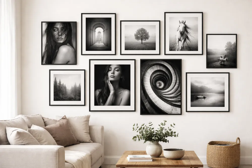
A Sample Monochrome Wall to Inspire You
Here's a real arrangement that works beautifully:
- Center: 16×20 portrait of a family member, dramatic natural light, forest background. Matte black frame, cream mat.
- Left of center: 8×10 graphic architecture shot (repeating windows or staircase). Black frame, no mat.
- Right of center: 11×14 misty landscape. Natural wood frame, warm white mat.
- Top row: Three 5×7 street photography shots. Matching matte black frames, thin black mats.
- Bottom accent: 8×10 abstract macro (leather texture, weathered wood grain). Black frame, no mat.
Total: 8 frames. One color family (matte black + one natural wood accent). Wildly different subjects that hang together because they share a tonal language.
Ready to Let Smart Fill Help?
Open GalleryPlanner with Smart Fill ready so you can test photo picks directly against your frame layout.
Launch GalleryPlanner