Color Curation for Gallery Walls
Use color grouping, tonal balance, and the 70/30 rule to make mixed photos and artwork feel cohesive across your entire gallery wall without overmatching every frame.
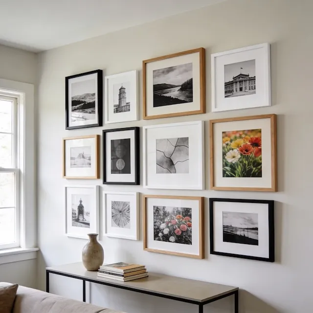
The fastest way to make mixed photos feel cohesive is to choose one dominant visual direction, like mostly color or mostly black and white, and let everything else support it. The 70/30 rule in this guide is the simplest way to do that.
The 70/30 Rule
The simplest formula for a cohesive gallery is 70% dominant style, 30% accent style. This applies to color vs. black and white, warm tones vs. cool tones, or any other visual characteristic.
| Dominant (70%) | Accent (30%) | Result |
|---|---|---|
| Black & white | Color accents | Sophisticated, editorial |
| Color photos | B&W anchors | Vibrant with grounding |
| Warm tones | Cool accents | Inviting, energetic |
Why 70/30? Equal splits feel indecisive—your eye doesn't know where to focus. A clear majority creates cohesion, while the minority adds interest.
When Black & White Works Magic
Converting photos to black and white is the fastest way to unify a mismatched collection. It's particularly powerful when you're working with:
| Scenario | Why B&W Works |
|---|---|
| Mixed photo sources | Unifies different cameras/eras |
| Clashing color temperatures | Eliminates the problem entirely |
| Formal/minimal interiors | Sophisticated, timeless feel |
| Strong subjects | Removes color distraction |
When the subject is powerful—emotional portraits, architectural details, dramatic moments—removing color focuses attention on what matters.
When to Embrace Color
Not every gallery should be black and white. Color brings energy and personality that B&W can't match.
| Scenario | Why Color Works |
|---|---|
| Nature/travel photography | Color is the subject |
| Children's artwork | Captures life and energy |
| Bold decor rooms | Complements the palette |
| Gallery as focal point | Color demands attention |
Understanding Color Temperature
Color temperature refers to how warm (red/orange/yellow) or cool (blue/green/purple) an image appears.
| Temperature | Colors | Feeling |
|---|---|---|
| Warm | Red, orange, yellow, brown | Cozy, energizing |
| Cool | Blue, green, purple, gray | Calm, refreshing |
| Neutral | Black, white, tan, cream | Balanced, timeless |
Warm photos feel cozy, nostalgic, and inviting. Cool photos feel calm, contemporary, and fresh. When photos with clashing temperatures sit side by side, the gallery feels chaotic.
| Mix | Works? |
|---|---|
| All warm | ✅ Cohesive |
| All cool | ✅ Unified |
| 70/30 warm/cool | ✅ Balanced |
| 50/50 warm/cool | ⚠️ Can feel chaotic |
Unifying Mismatched Photos
If your collection feels disjointed, you have two powerful options:
Convert to Black & White
Photos with different lighting, cameras, and eras instantly feel connected when converted to B&W. It's the universal equalizer.
Apply a Consistent Filter
If you want to keep color, apply the same preset to every photo:
| Filter Type | Effect | When to Use |
|---|---|---|
| Fade/matte | Lifts blacks, mutes colors | Modern, Instagram-style |
| Warm preset | Adds golden tones | Nostalgic, cozy |
| Desaturation | Muted colors | Calming clashing colors |
Color Psychology by Room
Consider where your gallery wall lives when choosing your color approach:
| Room | Recommended Palette | Why |
|---|---|---|
| Living room | Warm neutrals | Welcoming, social |
| Bedroom | Cool blues, soft greens | Calm, restful |
| Dining room | Rich, warm tones | Appetite, conversation |
| Home office | Balanced, neutral | Focus, not distracting |
Frame Color Coordination
Don't forget that frames are part of your color story too:
| Photo Style | Best Frame Colors |
|---|---|
| B&W photos | Black, white, or silver |
| Warm-toned photos | Natural wood, gold, black |
| Cool-toned photos | Black, white, silver, gray |
| Mixed gallery | Limit to 2-3 frame colors |
Key rule: Limit yourself to 2-3 frame colors across the whole gallery. A rainbow of frame colors reads as accessories that don't match.
Quick Curation Checklist
Before committing to print:
| Check | ✅ Good | ❌ Fix |
|---|---|---|
| Dominant style clear? | 70%+ one style | Mix too even |
| Temperatures match? | Mostly warm OR cool | Hot and cold fighting |
| Frame colors limited? | 2-3 colors max | Rainbow of frames |
| Strongest images kept? | Quality over quantity | Filler dilutes impact |
Ready to Let Smart Fill Help?
Open GalleryPlanner with Smart Fill ready so you can test photo picks directly against your frame layout.
Launch GalleryPlanner