Portrait Perfect: Designing a Gallery Wall Centered on People
Design a portrait-driven gallery wall that mixes hero shots, candids, details, and older family photos into a display that feels personal and well paced.
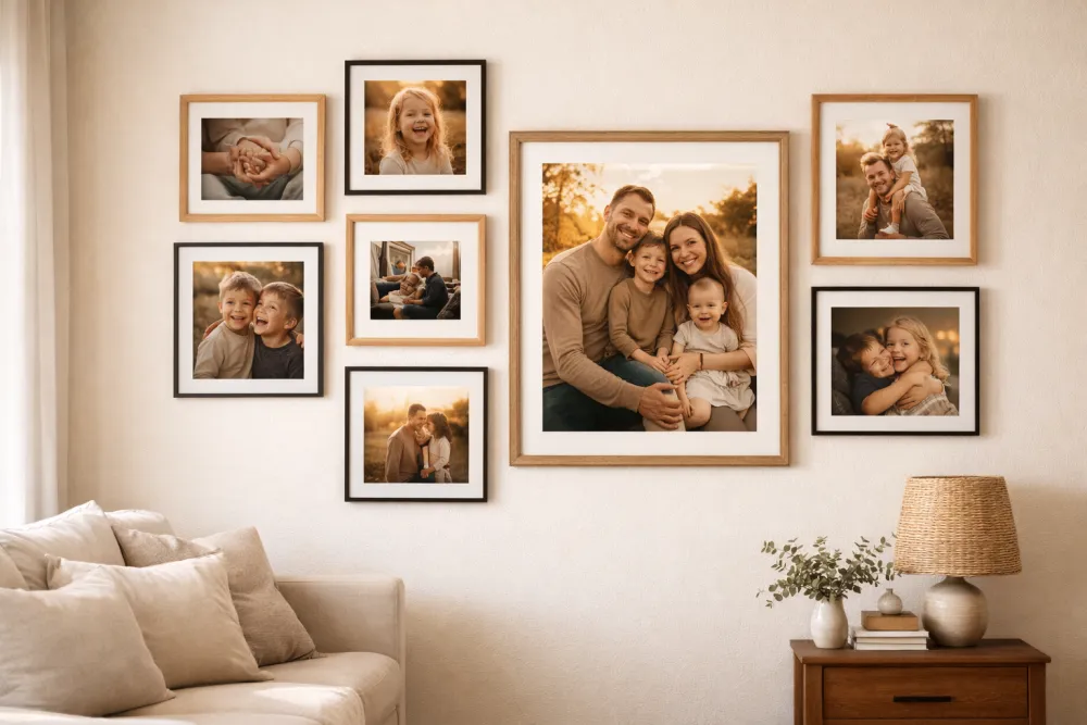
The best portrait gallery wall mixes hero shots, candids, and smaller detail images so the wall feels personal without turning into a row of school portraits. That balance keeps the subject matter human and the composition readable.
Here's how to mix candids with portraits, old with new, intimate close-ups with wide environmental shots—and how to arrange people-centered photography into something genuinely moving.
Why People Walls Go Wrong (And How to Fix It)
The most common mistake is treating a person-wall like a proof sheet. Every shot taken the same way, from the same distance, in front of the same backgrounds. The result feels like documentation rather than celebration.
Great portrait walls are editorial. They tell a story through contrast and variety.
The Six Shot Types You Need
For a truly dynamic portrait wall, aim to include at least four of these six types:
1. The Hero Portrait
A formal or considered portrait of a person or group. Professional or professionally composed. Good light. Subject looking at the camera. This is your wall's anchor.
Example: A framed family portrait session. A stunning senior portrait. A black-and-white photograph of a grandparent.
2. The Candid
An unposed moment of genuine emotion. Laughing, running, sleeping, hugging. Technically imperfect is fine—blur and grain can add life.
Example: Kids caught mid-laugh at the dinner table. A couple on a spontaneous walk.
3. The Detail
Close-up of something human but not a face: tiny hands, a child's feet in oversized boots, a grandmother's hands with her wedding ring. These are often the most emotionally powerful images on a portrait wall.
Example: Newborn feet. Hands holding hands. A person's face cropped to show only their eyes.
4. The Environmental
A person shown in a place that defines them—at their desk, in their garden, on a favorite hiking trail. Subjects feel like fully realized people rather than subjects standing in front of a camera.
Example: A grandfather in his workshop. A child in their bedroom surrounded by their favorite things.
5. The Milestone
Celebrations, achievements, or passages of time. Birthdays, graduations, first days of school, wedding days. These images mark time explicitly.
Example: A first birthday. A graduation cap toss. A first step.
6. The Archive
Old photographs of family members, ancestors, or the family home. Even a low-quality scan of an old print adds depth and context to a contemporary wall.
Example: A wedding photo of your grandparents. A childhood photo of a parent. A scanned baby photo from the 1970s.
The "Wall of Heads" Problem: Specific Fixes
If your current or planned wall feels like too many faces staring at you, apply one or more of these corrections:
| Problem | Fix |
|---|---|
| All formal portraits | Swap 2–3 for candids or environmental shots |
| All close-up faces | Add 1–2 detail shots and 1 environmental |
| All recent photos | Add 1–2 archive images from other generations |
| All same size | Introduce one noticeably large anchor (16×20) and some small accents (4×6) |
| Same lighting in every shot | Mix indoor, outdoor, and golden-hour shots |
| Only one family unit | Add individual portraits of kids or grandparents |
Composition: Grouping People Meaningfully
The Nuclear Cluster
Place photos of the same family "unit" near each other—but don't make perfect symmetrical blocks. Cluster them loosely with 2–3 inches between images within the cluster, and 4–5 inches between clusters.
Example grouping:
- Large parent-and-kids shot (center)
- Two individual children's portraits (flanking, slightly offset in height)
- A candid of all three kids together (corner of the cluster)
The Generational Column
Arrange photos in an informal timeline column from older to newer, top-to-bottom or left-to-right. This works beautifully in a hallway where people walk past it over time.
Example: Great-grandparents (top/left) → Grandparents → Parents → Current generation (bottom/right)
The Interleaved Mix
Don't group by subject—instead, distribute different people and shot types across the whole wall so the eye flows unpredictably. Break apart the obvious groupings.
Example: A portrait of a child → a candid of two adults → a detail shot → a landscape with a person in it → a milestone image.
This approach is the most editorial and feels the most like a curated exhibition.
Technical Considerations for Portrait Photography
Cropping Principles
When you load photos into GalleryPlanner and adjust the crop within each frame, follow these rules:
- Never cut through the top of someone's head. A small amount of "air" above the head is important.
- Eyes should sit in the upper third of the frame, not dead center.
- Avoid cropping at joints: Don't crop at the wrist, knee, or neck. Crop at the mid-forearm, mid-thigh, etc.
- Group shots: Center on faces, not on torsos. The faces are the subject.
Resolution for Large Portrait Prints
Portraits printed large show every flaw in sharpness and resolution. Use GalleryPlanner's resolution warnings as your guide:
| Frame Size | Minimum Recommended Resolution |
|---|---|
| 5×7 | 1050 × 1470 px |
| 8×10 | 1600 × 2000 px |
| 11×14 | 2200 × 2800 px |
| 16×20 | 3200 × 4000 px |
| 20×24 | 4000 × 4800 px |
Phone photos from the last five years (12+ megapixels) generally have more than enough resolution for frames up to 16×20.
Using Smart Fill for Portrait Walls
GalleryPlanner's Smart Fill AI includes face detection. Enable the "Target Faces" toggle in Smart Fill settings, and the AI will:
- Scan your uploaded library and identify images with detected faces.
- Prioritize face-containing photos for placement.
- Automatically adjust the crop to center on detected faces rather than centering the frame.
This is especially useful when you have a large mixed photo library (travel, landscapes, portraits all together) and want to quickly populate a portrait-focused wall.
Frame Style for Portrait Walls
Portraits carry emotional weight. Your frames should support the photos, not compete with them.
| Style | Best For |
|---|---|
| Simple black matte | Contemporary, editorial; draws maximum attention to the photo |
| Thin walnut or natural wood | Warm, organic; feels like a home rather than a gallery |
| Antique gold or ornate | Multigenerational, formal families; works beautifully with archival photos |
| White with wide mat | Light, airy; modern farmhouse or Scandinavian interiors |
The most common mistake: Using overly ornate frames with contemporary portrait photography. The frame fights the photo. Save ornate frames for archival or painted pieces.
Hanging Tips for Portrait Orientation
Most portrait photography is shot vertically. A wall full of vertical frames can feel narrow and tall. Balance it by:
- Using horizontal landscape portraits (family groups or environmental shots) as connecting elements.
- Alternating horizontal and vertical frames even within the same subject matter.
- Including at least one square format image (these translate beautifully from Instagram or phone photography).
- Allowing a few wider frames with white mats to give horizontal breathing room to a vertical subject.
A Beginner Portrait Wall Layout
A starting point for a 6-frame wall above a sofa:
- Center-top: 16×20 hero portrait (family group or a powerful individual portrait). Natural wood frame.
- Left of center: 8×10 landscape environmental shot. Black frame.
- Right of center: 8×10 candid moment. Black frame.
- Bottom left: 5×7 detail shot (hands, feet, child's objects). Black frame.
- Bottom center: 5×7 archive/generational photo. Antique gold frame, slight accent.
- Bottom right: 5×7 milestone (birthday, first day, graduation). Black frame.
Consistent (but not identical) black frames with one accent pull it all together.
Ready to Let Smart Fill Help?
Open GalleryPlanner with Smart Fill ready so you can test photo picks directly against your frame layout.
Launch GalleryPlanner