How to Size Artwork for Your Room
The 2/3 rule, room-by-room sizing guidelines, the tape-it-out method, and scaling math shortcuts that help you stop hanging art that is too small for your wall.
The number one mistake in home decorating is artwork that's too small for the wall it's on. A single 8x10 photo centered above a king-size bed. A modest 11x14 print floating on a 10-foot living room wall. It reads as an afterthought — like you hung the first thing you found and never came back.
Getting scale right isn't about buying the biggest frame you can afford. It's about proportion: the relationship between the art, the wall, and the furniture in the room.
The 2/3 Rule
This is the most reliable rule of thumb in art sizing, and it works in almost every room:
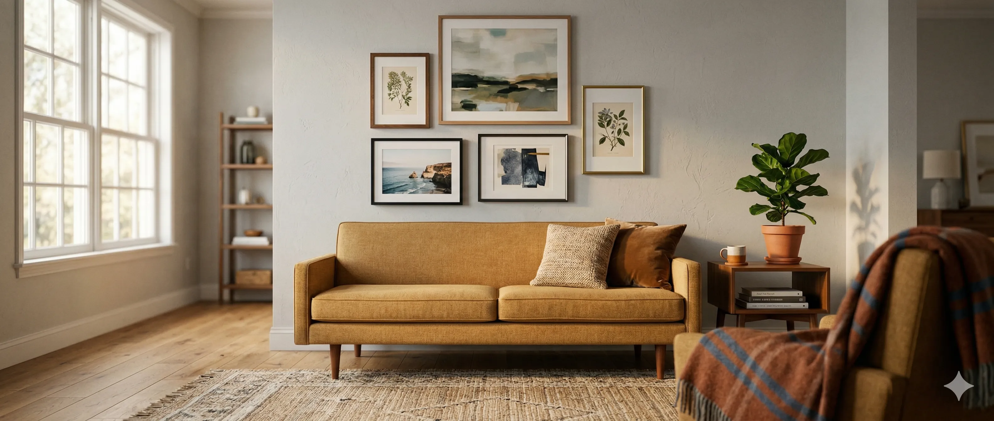
Your art (or art grouping) should be approximately 2/3 the width of the furniture beneath it.
| Furniture Width | Art/Gallery Width (2/3) | Example |
|---|---|---|
| 60" sofa | ~40" | One 30x40 piece or a gallery grouping spanning 40" |
| 48" console | ~32" | One 24x30 piece or a 3-frame arrangement |
| 72" headboard | ~48" | A gallery wall grouping or a pair of 20x24 pieces |
| 36" nightstand | ~24" | One 16x20 or a pair of 8x10 frames |
This isn't a rigid formula. Going slightly wider (up to 75%) looks confident and intentional. Going narrower than 50% starts to look undersized. The 2/3 zone is where most arrangements feel balanced without thinking about it.
The "Postage Stamp" Problem
When artwork is too small for its wall, designers call it the "postage stamp effect." The piece looks like it's been stuck onto a vast empty surface — lost rather than displayed.
How to Diagnose It
Stand across the room from your art. If the wall dominates and the art barely registers, it's too small. Good art sizing creates a dialogue between the piece and the wall — neither should overwhelm the other.
How to Fix It
| Current Situation | Fix |
|---|---|
| Single small frame on a large wall | Upgrade to a larger frame, or build a gallery grouping that fills the same visual footprint |
| Gallery wall that looks sparse | Add more frames, increase individual frame sizes, or reduce spacing to tighten the grouping |
| Art above furniture that looks disconnected | Check the 2/3 rule — art may need to be wider, or hung lower |
Room-by-Room Guidelines
Different rooms have different energy, viewing distances, and functions. What works in a living room feels wrong in a bedroom. Here's how to adjust.
Living Room
The living room is where you go bold. Viewing distances are longer (you see the wall from across the room), and the wall typically competes with large furniture, windows, and foot traffic.
| Guideline | Recommendation |
|---|---|
| Statement wall | One large piece (30x40 or bigger) or a gallery grouping that spans 4–6 feet |
| Above the sofa | Art grouping should be 2/3 to 3/4 the sofa width |
| Focal point height | Center the arrangement at 57–60" from the floor (standard eye level) |
| Minimum frame size | 16x20 for individual pieces; anything smaller gets lost from across the room |
Hallway
Hallways are serial experiences — you walk past art rather than sitting in front of it. This changes the rules.
| Guideline | Recommendation |
|---|---|
| Format | A long horizontal row or salon-style arrangement that runs the length of the hall |
| Frame sizes | Medium works best — 8x10 to 11x14. Large frames in a narrow hallway feel oppressive |
| Spacing | Consistent 2–3" gaps. In hallways, uneven spacing reads as careless rather than artistic |
| Depth | Thin-profile frames (under 1") in hallways narrower than 36 inches |
Bedroom
Bedrooms are intimate, low-energy spaces. You typically view the art from the bed (lying down, looking up) or from the doorway. Overwhelming scale works against the purpose of the room.
| Guideline | Recommendation |
|---|---|
| Above the bed | A grouping that's 2/3 the headboard width, hung 6–10" above the headboard |
| Tone | Calmer content — landscapes, abstracts, soft photography. Save the bold graphic art for the living room |
| Opposite the bed | This is what you see when you wake up. Choose something you want to look at first thing. |
| Nightstand art | Small and personal. 5x7 or 8x10, nothing larger, or it crowds the lamp and alarm clock |
Dining Room
| Guideline | Recommendation |
|---|---|
| Above a buffet/sideboard | 2/3 rule applies. Match the formality of the furniture. |
| On an empty wall | Go large or go gallery. A single small piece in a dining room feels like you forgot to finish decorating. |
| Content | Still life, food photography, abstracts, and landscapes all work. Avoid anything jarring during meals. |
The "Tape It Out" Method
Before spending money on frames, test your sizing directly on the wall:
- Measure the intended art dimensions (or gallery grouping footprint).
- Cut kraft paper or newspaper to those dimensions.
- Tape it to the wall with painter's tape at the planned height.
- Live with it for a day. Look at it from your normal positions — the couch, the dining chair, the doorway.
- Adjust. If it feels small, cut a larger template. If it overwhelms, scale down.
This takes 10 minutes and saves you from buying the wrong size frame — or worse, hanging the wrong size frame and leaving it there because you already put holes in the wall.
Digital version: Do the same thing in GalleryPlanner. Set your wall dimensions, add frames at the sizes you're considering, and see the proportions instantly. Faster than cutting paper and easier to iterate.
Scaling Math Shortcuts
If you want quick sizing without pulling out a calculator:
| Wall Space Width | Solo Piece | Gallery Grouping |
|---|---|---|
| 3 feet | 16x20 to 18x24 | 3 frames spanning ~24" |
| 5 feet | 24x30 to 30x40 | 5–7 frames spanning ~40" |
| 8 feet | 30x40 or larger | 7–12 frames spanning ~60" |
| 10+ feet | 36x48 or oversized | 12+ frames or a salon wall spanning 6–8 feet |
These are starting points. Actual sizing depends on what's below the art, ceiling height, and how the room feels — but they'll get you in the right ballpark.
When Bigger Isn't Better
There are a few situations where restraint wins:
- Gallery walls in stairwells — Large frames at stair-step angles can feel imposing. Medium sizes (8x10 to 11x14) navigate the angles better.
- Above narrow furniture — A 40" wide piece above a 24" nightstand looks top-heavy and unmoored.
- Small rooms where art is viewed up close — A 5x7 photo in a bedroom alcove can be more impactful than a 24x36 print viewed from inches away. Small spaces reward detail.
Visualize Before You Buy
GalleryPlanner lets you set your real wall dimensions and try different frame sizes to see how they'll actually look at scale. It's faster than cutting paper templates and lets you experiment with dozens of configurations before committing to a single nail hole.
Ready to Plan Your Frames?
Open GalleryPlanner with frame tools ready so you can build your library and start sizing your wall.
Launch GalleryPlanner