Beyond Photography: Building a Gallery Wall with Art, Objects & Textiles
Design a gallery wall with art prints, original paintings, mirrors, textiles, and sculptural pieces when you want a collection that goes beyond framed photos.
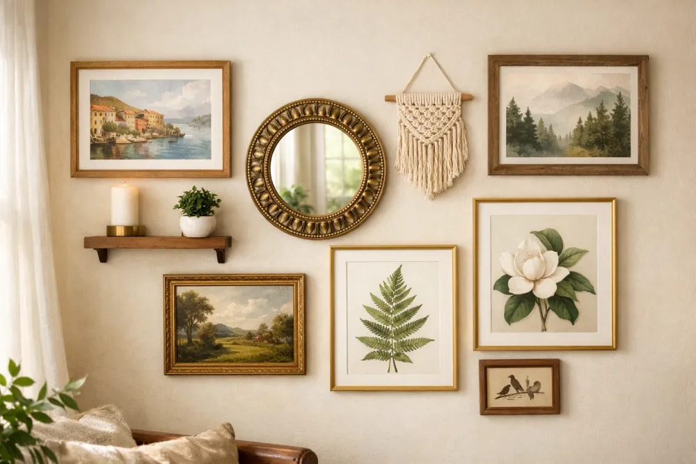
A gallery wall doesn't have to be a photo wall. Some of the most striking, personality-filled displays in interior design feature zero photographs—and many of the best ones are a deliberate mix of mediums. This guide covers how to incorporate prints, paintings, textiles, 3D objects, mirrors, and more into a cohesive, layered display.
Why Go Beyond Photos?
Photographs are powerful, but a wall limited to rectangular photos can feel flat—literally and figuratively. Mixed-media gallery walls create:
- Depth and texture: Objects that protrude from the wall create shadow and dimension.
- Narrative richness: A seashell from a beach trip, a postcard from a grandparent, and a watercolor by your kid tell a story no single photograph can.
- Timelessness: Art prints and original paintings often age more gracefully than family photos when decorating shared spaces like living rooms.
The 7 Elements of a Mixed-Media Gallery Wall
1. Art Prints & Posters
The backbone of most non-photographic walls. Look for:
- Limited-edition art prints from independent artists (Society6, Minted, Etsy)
- Museum reproductions of works you love (MoMA, the Met, LACMA all offer high-quality prints)
- Vintage botanical or scientific illustrations (widely available, free to download, beautiful when printed)
Framing tip: Botanical and scientific prints sing in simple matte white or off-white frames with a wide mat. The mat becomes part of the composition.
2. Original Paintings & Drawings
If you or someone you know creates art, a gallery wall is the perfect showcase. You don't have to stick to gallery-ready pieces:
- A child's watercolor in a nice frame becomes a design statement.
- A charcoal sketch or ink drawing adds a raw, handmade quality.
- Small, expressive oil paintings add color depth that prints can't replicate.
Framing tip: Original work on irregular paper or canvas can be floated (mounted slightly away from the backing) for a premium look that respects the artwork.
3. Mirrors
A mirror in your gallery wall is one of the smartest design moves you can make. It:
- Opens up the space visually
- Bounces light into darker rooms
- Adds a shape break (arched, round, irregular) to a sea of rectangles
How to use it: Treat a mirror as your "anchor" piece—place it at or near the center of the arrangement. A round mirror in a sea of rectangular frames is a classic, high-impact choice.
4. Textiles & Fiber Art
Woven wall hangings, tapestries, macramé, and embroidery hoops are some of the most underused gallery wall elements.
| Type | Best For | Where to Find |
|---|---|---|
| Macramé | Bohemian, earthy interiors | Etsy, local craft fairs |
| Tapestry/Woven | Warm, layered looks | Anthropologie, vintage shops |
| Embroidery hoop | Eclectic, colorful accent | Etsy, DIY |
| Vintage fabric/quilt square | Farmhouse, traditional | Antique stores |
Practical note: Textiles need to be mounted cleanly. Use a thin wooden dowel along the top edge with a hidden nail, or frame the piece behind glass if humidity is a concern.
5. Functional Objects & Shelves
Three-dimensional elements give a gallery wall a curated, collected feel that nothing else replicates.
- Small floating shelves: Mount a 4–6 inch shelf as part of the arrangement and use it to hold a candle, small plant, or ceramic.
- Decorative plates: Plate racks or adhesive plate discs let you hang china, handmade pottery, or vintage transferware.
- Sculptural wall objects: Carved wood pieces, metal art, woven baskets hung flat, and ceramic vessels all work.
- Clocks: A beautiful analog clock serves a function and adds visual interest. The moving hands create delightful contrast with still photographs.
A good rule of thumb: Limit 3D objects to no more than 20–25% of your wall. More than that and the arrangement starts to feel cluttered rather than curated.
6. Pressed Botanicals & Natural Objects
Dried flowers, pressed leaves, feathers, and other natural specimens framed behind glass are genuinely beautiful and often cheap to make yourself.
DIY process:
- Press flowers or leaves in a heavy book for 2–3 weeks.
- Arrange on archival (acid-free) mat paper.
- Seal under UV-protective glass to prevent fading.
- Frame in a simple frame with a wide mat.
The result looks expensive, is deeply personal, and ages beautifully.
7. Typography & Objects with Words
Quotes, initials, maps of meaningful places, and typographic prints add meaning and personality.
- A vintage map of a city you love or a place your family is from.
- Letter art: A framed pressed-metal initial, a beautifully typeset font print.
- Sheet music: Frame a page from a meaningful song.
Composition Tips for Mixed Arrangements
Because you're mixing depths, sizes, colors, and materials, composition becomes more important—not less.
The Pre-Plan Rule
Never put a nail in the wall without planning first. Lay your entire collection on the floor in roughly the arrangement you have in mind. Live with it for a day. Walk past it. Adjust.
Repetition Creates Cohesion
Even in a wildly eclectic mix, repeat at least one element:
- Frame color: Two or three frames in the same finish (black, gold, natural wood) anchor the arrangement.
- Mat color: A consistent off-white mat across many pieces creates visual unity.
- Shape: Repeat a circle (plate, mirror, wreath) two or three times.
Use GalleryPlanner for the 2D Layout
Even if some elements are irregular or 3D, plan the overall arrangement digitally first. In GalleryPlanner, enter the bounding-box dimensions of each object (a round mirror goes in as a 20×20 square, for example). This gives you accurate spacing before you commit to holes.
🏗️ The gap between the plan and the wall. Digital planning nails your spacing perfectly in two dimensions. What it can't simulate is depth. A floating shelf protrudes 4", your canvas prints protrude 1", your frames protrude ½"—and when they're all next to each other, shadows, sight lines, and physical awkwardness emerge that your screen never predicted. Plan in GalleryPlanner first, always. Then do a dry-run with paper templates taped to the wall before you hang anything heavy.
The "Anchor + Satellites" Approach
Choose one element as your anchor—usually your largest or most visually striking piece. Build the rest of the arrangement around it.
What to Avoid
| ❌ Mistake | ✅ Fix |
|---|---|
| All the same depth | Mix flat frames with one or two protruding objects |
| Too many colors | Limit your palette to 3–4 complementary tones |
| No breathing room | Leave 2–3 inches between elements |
| Random theme | Every piece should connect to a single mood, story, or palette |
| Ignoring scale | Your largest piece should be at least 3–4× the size of your smallest |
Getting Started: A Beginner's Mixed-Media Wall
If you've never done this before, here's a low-commitment starter arrangement:
- One large art print or painting (11×14 or 16×20) as the anchor.
- Two medium photo frames (8×10) flanking it with photographs.
- One round mirror above or beside the anchor.
- One small botanical or typographic print (5×7) to fill a corner.
- One textile or small shelf object for texture.
That's five elements. Plan it in GalleryPlanner, print your hanging guide, and enjoy a wall that looks like you curated it over decades.
Ready to Keep Planning?
Open GalleryPlanner and jump back into your current wall plan without forcing you into a specific tool first.
Launch GalleryPlanner