Beyond the Frame: Designing Around Sconces, Switches, and Vents
Plan around Wall Objects, sconces, switches, vents, thermostats, and other wall obstacles so your gallery layout feels intentional instead of compromised, crowded, or improvised.
Wall Objects (Pro) are the preferred way to map real fixtures on the canvas. Use them for TVs, windows, doors, fireplaces, vents, sconces, shelves, sofas, headboards, thermostats, and custom wall features. For larger reserved areas or more complex cut-outs, use Layout Zones. The old labeled-locked-frame trick still works as a fallback for legacy projects, but it is no longer the main workflow.
1. Map the real obstacle
Before you place anything, measure the actual feature on the wall.
- Measure the center point: For light switches, sconces, vents, and similar fixtures, note their distance from a corner and from the floor.
- Leave a buffer: Add an extra 1-2 inches around the object in your mental layout so a frame does not crowd it.
2. Add a Wall Object
Instead of faking a fixture with a blank frame, add the real thing as a Wall Object.
- Open the Objects tab.
- Pick the closest preset: Window, Door, Fireplace, TV, Sconce, Shelf, Vent, Sofa, Headboard, Thermostat, Light switch, or Custom.
- Drag it into position and match the size to the real object on the wall.
- Rename it if you want a clearer label in the editor or export.
Tip: Use Custom for fixtures that do not fit the presets, or when you need a rough placeholder for something unusual.
2b. Pro Shortcut: Layout Zones
If you want a cleaner Pro workflow for a larger usable area, use Layout Zones.
- Draw the usable wall region once and let Auto-Layout respect it
- Keep the obstacle layer separate from your actual art
- Use zones for rooms with multiple constraints or when the gallery only fills part of the wall
Layout Zones are the automated Pro alternative when you want to reserve a region instead of modeling every obstacle individually.
3. Design Strategies: Embrace or Erase?
How you design around an obstacle depends on its visual "weight."
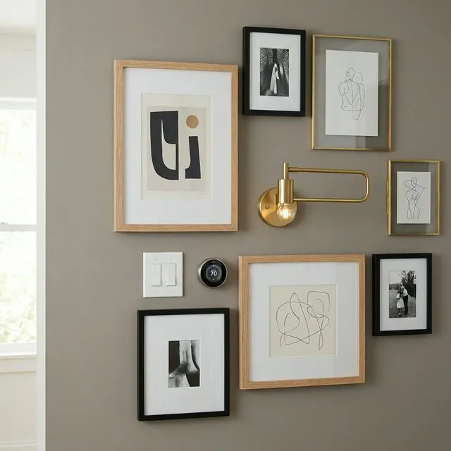
The "Embrace" Method (Symmetry)
Use a decorative object like a wall sconce or fireplace opening as the center anchor of your layout.
- Add the matching Wall Object.
- Use Auto-Layout to build a symmetrical arrangement around it.
- Let the object become part of the composition instead of something to hide.
The "Erase" Method (Organic Flow)
For necessities like thermostats or light switches, you want the eye to move past them.
- Use an Asymmetrical or Salon layout.
- Distribute frames around the object with varied spacing.
- Because the layout is already organic, the object reads as a normal part of the wall instead of a problem to cover.
4. Troubleshooting Common Constraints
The Heating Vent
Vents are usually near the floor. Design your gallery wall with a high Skyline so the bottom row stays comfortably above the airflow and dust.
The Intercom / Thermostat
These are often at eye level and can become focal points. Surround them with 3-4 small, high-interest frames if you want to frame the feature instead of avoiding it.
The Corner Light Switch
If your gallery wall starts near a door, treat the switch as a start line. Align the edge of your first frame cluster with the horizontal line of the switch plate for a clean, architectural look.
Summary: Designing in the Real World
A perfect gallery wall is one that looks like it belongs in your specific home. By measuring your constraints and using Wall Objects and Layout Zones, you can turn a challenging wall into a professional-grade installation.
Ready to Generate a Layout?
Open GalleryPlanner with Auto-Layout ready and turn these ideas into a wall plan with real dimensions.
Launch GalleryPlanner