Corner Gallery Wall Layout Guide
Design gallery walls that wrap around corners with better transitions, anchor points, and spacing so both walls feel connected instead of competing for attention.
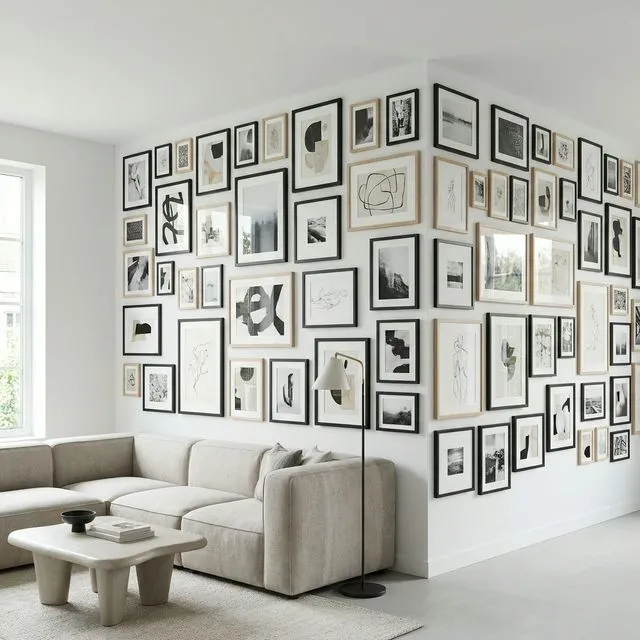
Want your gallery wall to flow around a corner? It's one of the most impressive—and challenging—installations. When executed well, a corner gallery transforms a room's geometry from obstacle to feature. This guide covers the techniques for making two perpendicular walls read as one seamless display.
When Corner Galleries Work Best
Not every corner is right for this treatment. Here's a quick decision guide:
| Scenario | Good Fit? | Notes |
|---|---|---|
| Open-plan living areas | ✅ Yes | Corner defines the space beautifully |
| L-shaped rooms | ✅ Yes | Natural focal point |
| Corners near doorways | ⚠️ Maybe | Consider foot traffic |
| Narrow hallways | ❌ No | Too cramped |
| Corners with windows | ❌ No | Light competition |
The Two Main Techniques
The Seamless Wrap
Think of the corner as a fold in paper—the gallery continues right across it. Use consistent spacing on both walls (2-3 inches is standard), maintain the same centerline height, and place at least one frame within 3-6 inches of the corner itself. That "bridge" frame is what makes the two walls feel connected.
The key is treating both walls as one design, not two separate galleries that happen to meet.
The Diagonal Bridge
Instead of a seamless flow, use a special element in the corner to connect two distinct galleries:
| Bridge Type | Description | Best For |
|---|---|---|
| Corner shelf | L-shaped ledge | Leaning art, objects |
| Statement piece | Large frame near both walls | Focal point |
| Decorative object | Plant, sculpture, clock | Breaking up frames |
This approach works better when you're mixing frame styles or want each wall to have its own character while still feeling unified.
Spacing Rules
Standard gallery wall spacing of 2-3 inches between frames works on both walls, but the corner itself needs special attention.
| Location | Spacing |
|---|---|
| Frame-to-frame | 2-3" (standard) |
| Frame-to-corner edge | 3-6" (breathing room) |
| Across corner (visual) | 4-6" at closest points |
Key principle: Use the same spacing measurement throughout the entire installation—both walls and near the corner. This consistency is what makes it feel like one cohesive gallery.
Balancing Visual Weight
The two walls don't need to look identical, but they should feel balanced:
| Wall A | Wall B | Result |
|---|---|---|
| Large anchor frame | Several smaller frames | ✅ Balanced |
| Dense salon style | Dense salon style | ✅ Cohesive |
| Sparse minimalist | Dense maximalist | ❌ Jarring |
Step back frequently while planning to check the balance. Your eye will tell you when something feels lopsided.
Height Considerations
Maintain the same centerline height across both walls—typically 57-60 inches from the floor. This is what makes your eye flow naturally around the corner. Different heights on each wall break the connection and make the gallery feel like two separate installations.
Common Mistakes
| ❌ Mistake | ✅ Fix |
|---|---|
| Ignoring the corner completely | Place at least one frame within 6" of corner |
| Frame directly in the corner | Leave 3-6" minimum clearance |
| Different heights on each wall | Use consistent centerline |
| Overcrowding the corner area | Let the corner breathe |
Planning in GalleryPlanner
Since GalleryPlanner works with one flat wall at a time, create two separate projects—one for each wall. Match the wall widths to your actual space, use the same frame library for both, and export PDF guides (Pro Only) for each wall separately.
Ready to Generate a Layout?
Open GalleryPlanner with Auto-Layout ready and turn these ideas into a wall plan with real dimensions.
Launch GalleryPlanner