Designing Against Your Real Wall: Using Wall Textures in GalleryPlanner
Preview your gallery wall against real-room textures and uploaded photos of your own wall so you can catch contrast, scale, and balance problems before install day.
The right wall texture can change how a gallery wall feels even when the frames stay put. GalleryPlanner's Wall Textures let you preview that difference against the wall or room you're actually designing for, instead of a blank white canvas.
Why the Wall Behind Matters
When you plan in a vacuum, a few real-world problems stay invisible until the frames are on the wall:
- Contrast disappears. Thin black frames over an Exposed Red Brick wall read completely differently than they do over Museum White plaster. A cluster that looks crisp on a blank canvas can vanish against a busy surface.
- Busy surfaces compete. Exposed brick, shiplap, and paneling have visual texture of their own. A dense salon wall can turn into noise when the wall itself is patterned. Simpler grids often work better.
- Scale gets confusing. A 40-inch cluster hovering on white feels huge. The same cluster above a real sofa in a real room often feels modest — and usually wants to grow to hit the right proportion.
- Color balance shifts. A photo set you curated to feel "warm" may read differently against a Dark Navy wall vs. a Warm Terracotta plaster vs. a Sage Green paint.
Previewing against a realistic wall — or the actual room — surfaces these problems early, while they're still easy to fix by editing the layout instead of by rearranging on the actual wall.
What's Available
GalleryPlanner ships with 19 stock textures in three sections:
Essentials (free)
Five textures designed to cover the most common walls:
- Museum White Plaster — gallery-neutral, the closest thing to designing in a vacuum
- Soft Linen Cream — warm off-white, a step warmer than museum white
- Warm Gray — mid-tone neutral, good for testing contrast
- Shiplap — horizontal white wood paneling, the farmhouse baseline
- Exposed Red Brick — industrial-loft standard for testing busy walls
Free users can also pick any solid color via the color picker.
Premium Textures (Pro)
Ten curated walls covering the most requested real-world finishes:
- Painted walls: Sage Green, Dark Navy, Dark Charcoal, Warm Terracotta
- Wainscoting: White Wainscoting + Greige
- Wood: Light Oak Slats, Light Oak Paneling, Dark Oak Paneling
- Brick & stone: White-Painted Brick, Raw Concrete
Furnished Rooms (Pro)
Four full-room scenes that put your layout in context with real furniture:
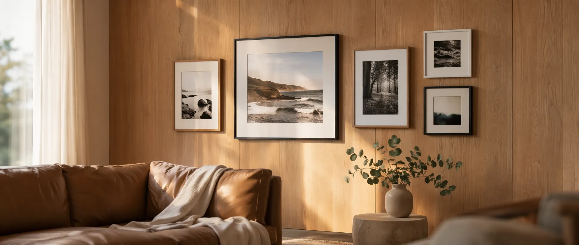
- Living Room Sofa — the above-the-couch test
- Living Room Credenza — shorter, wider groupings
- Bedroom Headboard — above-the-bed compositions
- Dining Room Table — formal dining-room arrangements
These are the fastest way to sanity-check whether your cluster is the right size for the room — not just the right shape on its own.
How to Pick the Right Texture
If you know the real wall
Match it as closely as you can. Three principles:
- Match the value (light/dark) before the exact color. A Dark Charcoal texture tells you most of what you need to know about how your layout reads on a dark wall, even if your real wall is navy.
- Match the "noise level." Shiplap is patterned; Museum White isn't. Pick a texture with similar visual activity so the preview tells you whether your cluster can compete.
- Use the furnished-room scenes for scale. If you're hanging above a sofa, the Living Room Sofa preview helps you catch "too small" before install day.
If you're designing for a future room
Use textures as a what-if tool. Mock up the same cluster on:
- Museum White (baseline)
- Sage Green or Dark Navy (if you're considering a feature wall)
- Light Oak Paneling (if you're thinking about paneling)
- Raw Concrete (if you're weighing an industrial look)
Often the clearest signal about "should we paint the wall?" comes from comparing the same layout against three or four texture options back to back.
If you're aiming for contrast, not camouflage
Gallery walls can either recede into the room or stand out as a focal point. Both are valid; they just want different textures.
- Recede: match frame color family to wall — dark frames on dark walls, light frames on light walls. Use a texture close to your real wall and see whether the cluster disappears.
- Stand out: invert it — dark frames on light walls, or white frames on dark walls. The texture preview will show you whether the contrast is strong enough without feeling harsh.
Upload Your Own Wall (Pro)
Stock textures are good. Your actual wall is better. Pro's custom texture upload lets you take a phone photo of the wall you're designing for and plan against it directly.
This is especially useful when:
- Your wall has a specific paint color or wallpaper that doesn't match any stock texture
- There's existing furniture or trim in the frame — the preview shows you real spatial constraints
- You're designing around architectural features like wainscoting strips, chair rails, or a crown molding line you want to respect
A few tips for the photo itself:
- Shoot straight on. Perpendicular to the wall, roughly centered. A tilted phone distorts scale.
- Get the whole intended area in frame. GalleryPlanner lets you zoom and reposition the texture, but the more of the wall is visible, the easier it is to line up.
- Daylight, or a consistent warm light. Mixed lighting in a photo makes it harder to judge how frame colors will read.
- Mask out temporary clutter. If your couch is where it's staying, leave it. If the laundry basket isn't, move it before you shoot.
Uploaded textures stay entirely on your device — they go into your browser's local storage, never to our servers. You can delete them at any time from the texture picker.
A Workflow That Gets Better Results
- Start on Museum White. Get the geometry right — frame counts, spacing, rough arrangement — on the neutral canvas first. Layout decisions are easier when the background isn't competing.
- Swap in a realistic texture once the layout feels close. Match your real wall or a furnished-room scene. You'll usually see at least one thing you want to adjust.
- Compare two or three textures for the same layout. Switching between Museum White, your real wall, and one "what-if" option (e.g., "what if we paint it sage green?") forces useful tradeoffs into the open.
- Finish on a realistic background. The final Snapshot or Hanging Guide PDF you share with a partner, a framer, or a client is more persuasive when it shows the room, not a whiteboard.
Frequently Asked Questions
Do Wall Textures affect Auto-Layout or Smart Fill? No. The texture is purely visual. Auto-Layout and Smart Fill treat wall dimensions and real frame geometry the same regardless of the background you picked.
Can I export with the texture visible? Yes. 4K snapshots and standard snapshots render the current wall texture. The Hanging Guide PDF stays on a clean white background since the goal of the PDF is installation clarity, not visual design.
Do custom uploads ever leave my device? No. Custom uploads are stored locally in your browser (the same IndexedDB database that holds your photos and projects). They are never sent to GalleryPlanner's servers.
How big can an uploaded texture be? Aim for a reasonably sized photo — a standard phone photo works fine. Very large files can slow down the editor; if that happens, resize before uploading.
Ready to Keep Planning?
Open GalleryPlanner and jump back into your current wall plan without forcing you into a specific tool first.
Launch GalleryPlanner